Hello everyone.
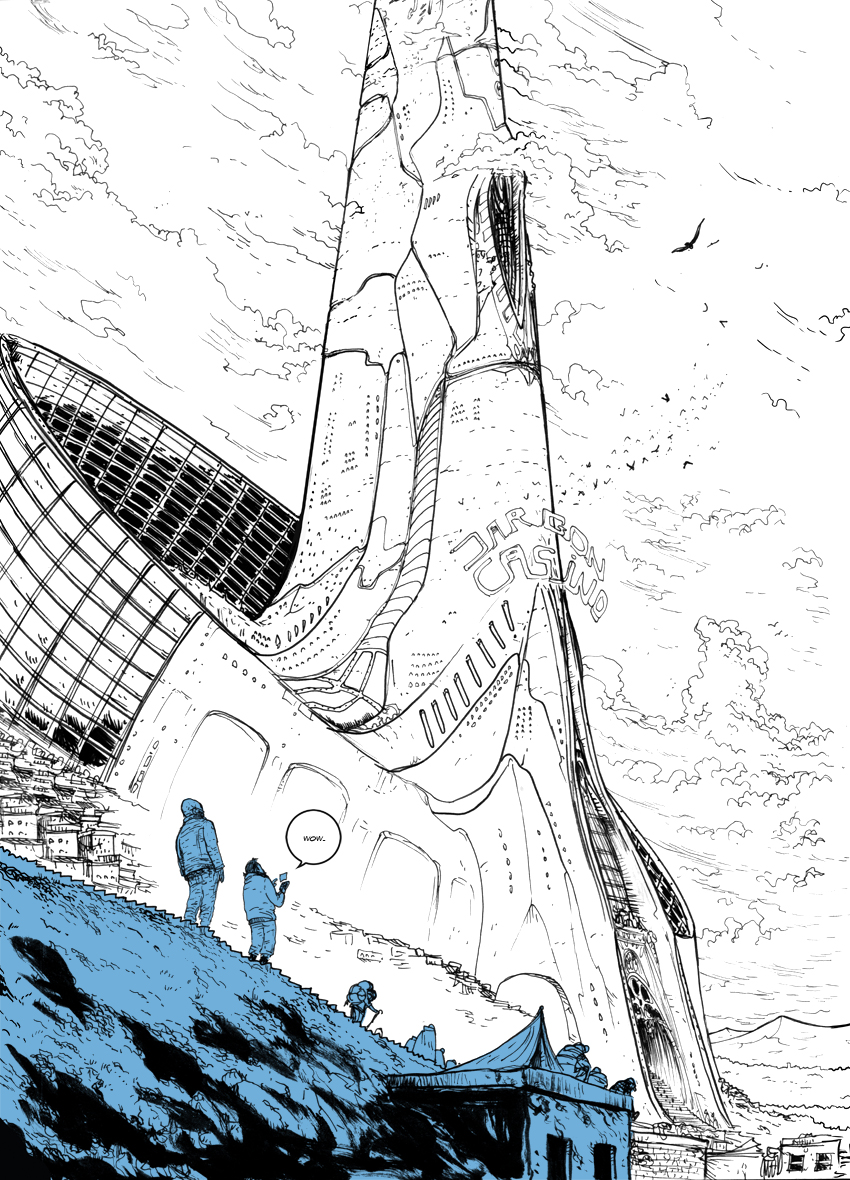
I am very happy with this page. Honestly, I wanted to show a preview of it in the blog like two weeks earlier, but I didn’t want to spoil anything. I hope you guys enjoy it.
It’s been a tough few weeks with Space-Mullet. Concepting characters and environments has been really frustrating lately. Just today things started getting better, but I’m planning on doing a bunch of redraws tomorrow and the next day. I’m thinking about going to the Museum of Science and Industry tomorrow to get some fresh mechanical sci-fi ideas in me. I guess I’m sharing this to vent, but also to say that if you’re in the middle of a creative venture, comic, video, illustration, whatever, and things are getting tough, don’t quit. Things will turn up eventually. You just gotta run through that wall of creative blockage. Like James Bond.
If you are viewing this and are from The Belfry Webcomic Index, welcome! It’s great to have you here!
Have a great weekend, guys.

Dan I love the casino building, and the perspective. I can only begin to imagine what it will look like inside!
dude, i look forward to seeing this page every monday and thursday. keep up the good work!
Ralph,
Thanks so much, dude! it’s wonderful to get encouragement from people who truly appreciate this.
Steve(dad),
Thanks Dad, the inside is a challenge! So much detail.
yes, definitely … there … wow, big.
I really did my best to make it seem really overpowering.
This page is astounding! Discovered your comic through justthefirstframe.com today, and read the whole lot. Keep it up, it’s really good and original.
Marten,
Thank you so much for taking the time to check it out! It means so much. Just the First Frame has gotten me some great visitors/readers, so welcome!
DWJ
Wow, amazing! Thank you for posting this comic on the internet. Viewing the pages in high-resolution is even more impressive. You should be proud of your work. A good mystery, a solid story background, what’s not to like? If I were to say what I like most about it, I’d go for the facial expressions. They’re so good, that you noticably get by with less dialogue. The faces say it all.
I haven’t seen a two-colour comic on the internet for a while. What made you you opt for black and blue rather than for b-w?
Frisian,
Thanks for the kind words about my work! I’ve done my best to bring a quality story to these characters. I’ve been a fan of b-w indie comics since I was a kid, reading Bone, and I love the walking dead. I wanted to do a full color comic, but I was still teaching middle school at the time, and I needed a way to make things stand out from the background/look sharp without sucking up too much time. But, I also loved how it looked, and it fit the Mood of my characters and setting. So, it started as a time saver, honestly, and turned into something that I really like, and that others are really digging too!
Dwj
The blue helps me appreciate the perspective view. Closer vs farther away.
Thank you! That’s what I use it for mostly, it really helps when making a black and white comic.
DWJ